Refreshed - Part 1: Quest for a Logo
Since I became fascinated with branding in 2009, I’ve been highly conscious of the logos companies choose. People may not pay much attention to logos because a logo doesn’t have a direct effect on them. But to me, a logo can be the first part of a story. I’m obsessed with logos, especially when they are well-done, because a good logo can embody the purpose of a person, organization, or company. Logos are a face. They are the face that everyone sees first and you should want your face to reflect your attitude and purpose.
Coming up with a logo to represent yourself is very, very challenging. I’ve been trying to come up with my own logo for the past few years. This article is about my approach, the challenges I faced, and the outcomes of that process.
The first time I realized I needed a logo was in 2009 when I wanted to start my own video production business. I named it Red Hawk Productions because I was mesmerized by the beautiful Red Tailed Hawks that surrounded my home. The logo didn’t receive much thought; I just found a cool picture of a Red-tail on Google Images, opened up Photoshop, and quickly composed a graphic that would be my “logo”. Red Hawk Productions didn’t last long and the logo quickly became a “cool little thing” I had made.
Fast-forward a couple of years and my focus shifted from video production to web design. I learned HTML and took some graphics courses which made me consider starting a small media firm that would offer website design, graphic design, and promotional video production for small businesses. I could call it Rooted Media because I liked the metaphorical connection between a tree and a business. Without good roots, a tree can never grow to become big and beautiful. The same can be said of a business, their roots being their purpose. Rooted Media would help businesses create marketing materials that reflected their core purpose, solidifying their roots and helping them grow (this is still very much inline with my view of building a brand). Rooted Media had a clear purpose and I wanted to create a logo which reflected that.
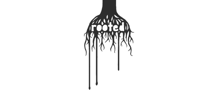
I still like this logo and the idea behind Rooted Media, but the domain name was already registered and I was not focused enough at the time to start a small venture (I never did much with Red-Hawk Productions and was still figuring things out in community college). Rooted Media didn’t represent me, it represented a business I wanted to start so it would not make a great fit as my logo.
Pretty soon after putting Rooted Media on the back-burner, I wanted to focus more on my own website and writing. A childhood friend of mine was doing a lot of great things online and I wanted to emulate him (I’ll write more on this very soon). I wanted a logo that was simple and slick but didn’t really think about what my purpose was. After a few weeks of designing in my head, I came up with this:

I liked it for about 2 minutes. The logo I envisioned in my head was supposed to be simple, elegant, recognizable. What I actually made was the chubby cousin of an asterisk. I used it on my website for a few months because I had nothing else to use but I knew I was still miles away from finding my logo. The search continued.
At this point I decided to write out the things that are important to me. This may sound like a stupid exercise but I hoped it would lead me towards something meaningful. This was my list:
- Family and friends
- Nature: trees, the ocean, hawks…
- Learning new things
- Communication between people
- Simplicity
- Authenticity
- Some other things I can’t remember…
The last year and a half has been like walking through a desert, severely dehydrated, hoping to stumble upon a logo oasis, but only seeing the occasional mirage. Sometimes I would sketch out the mirage to see if it was real but I always realized that it was not. About a year ago, I decided I could just use my initials, “MG” in some clean typeface. Or use MG surrounded by a circle or octagon, possibly include the year I was born. There was nothing wrong with that, but there was nothing special about it either and deep down I knew that. Some of my logo ideas from this past year are seen below. You’ll notice similar themes, especially with the tree (and don’t ask about the third one).

Then, out of nowhere, something hit me. I made the G look more like an arrow and things clicked. It looked like the refresh button of a web-browser and I liked that. Could it be? I opened up Illustrator and began creating the shape, refining it until it was my own. After some tweaks to the widths and roundness of the corners, I was finished. I felt happy.

It was such an amazing feeling… staring at something and not hating it, not seeing how it could be improved, and also realizing it represented me. I love it for four reasons:
It is clean and simple.
G is part of my name. Mike/Michael is a very common first name and in my group of friends, there are several Mikes so most of my friends just call me G. It’s not G for “Gansta” or something stupid like that but G for Granados.
It’s really similar to an inverted refresh symbol, a common symbol of the web. I click the refresh button all the time at work and at home (I actually use command + R but you get what I mean). Being part of the web means you recognize, use, and understand this symbol.
And finally just the arrow itself. It’s very Zen-like to me. Life is always moving and continuous but also repeating a pattern. Interpret it how you will but I like to think that we are always learning, always growing, and each time we complete a circle, we’ve gained something new for the next trip around.
I thought that I could just define my purpose and the things that are important to me and then a logo would create itself from there, but it didn’t happen like that for me. I understood the things I wanted my logo to represent but getting from the point of understanding to a graphical representation was one of the most difficult creative processes of my life.
My logo found me. I feel very lucky that it just jumped up and smacked me while I sketched out my initials on a quest through the desert. When I looked down and saw my oasis, I ran full-speed towards the symbol that could represent me. Discovering that it was real and not just another mirage was one of the best feelings in the world. The relief from an oasis is so very refreshing.
Read Refreshed - Part 2: Another Website Redesign.