Refreshed - Part 2: Another Website Redesign
I built the first version of my website about three years ago and it’s undergone a lot of changes in those three years. As my skills in HTML and CSS have improved along with my sense of design, I’ve constantly felt the need to refresh and improve the visual layout. Having a personal website has been fun little side hobby and this post is a chronicle of the changes I’ve made along the way.
Note: If you have not read Refreshed - Part 1: Quest for a Logo, you should read that first. It describes my struggle to find a visual identity and will help explain why my websites have looked the way they did.
Take 1 #
The first version of mikegranados.com was very simple (and boring). I had created my first logo specifically for this website which I wanted to try it out with some black and white contrast. It had a similar look to the original website of Dustin Curtis, a family friend who helped inspire my efforts in visual design. During this version, I wanted to make each post a unique page design (again, similar to Dustin) but I only got around to publishing one essay, Old-Fashioned Interactions.

Testing New Roots #
I quickly realized my lame asterisk logo and black and white design wasn’t doing much and wanted to fuse in a cooler logo I previously created. I love trees and wanted earthy color-tones, hoping it would help distinguish my website and provide some sense of identity. I was still only a year into HTML and web design so while the version below is nothing special, I was very proud of it at the time. It even had a fancy pop-up window contact form, how couldn’t you love that?

Wandering #
After about one year of my brown, tree-covered homepage, I wanted something more unique. I decided to use a black and white picture of myself, add some animated thought bubbles to give it some humor and personality, and use a subtly textured background. I wanted the different parts to be clear so I added some small stroked arrows for direction. I struggled choosing a font for the headers and ended up with a artsy display typeface. The combo of goofy picture, random thought bubble, font choice, and tiny arrows made the whole layout “funky”… not something longterm. I still had no logo or identity to work around which was clearly visible on my homepage. I now recognized my need for a logo more than ever.

Today #
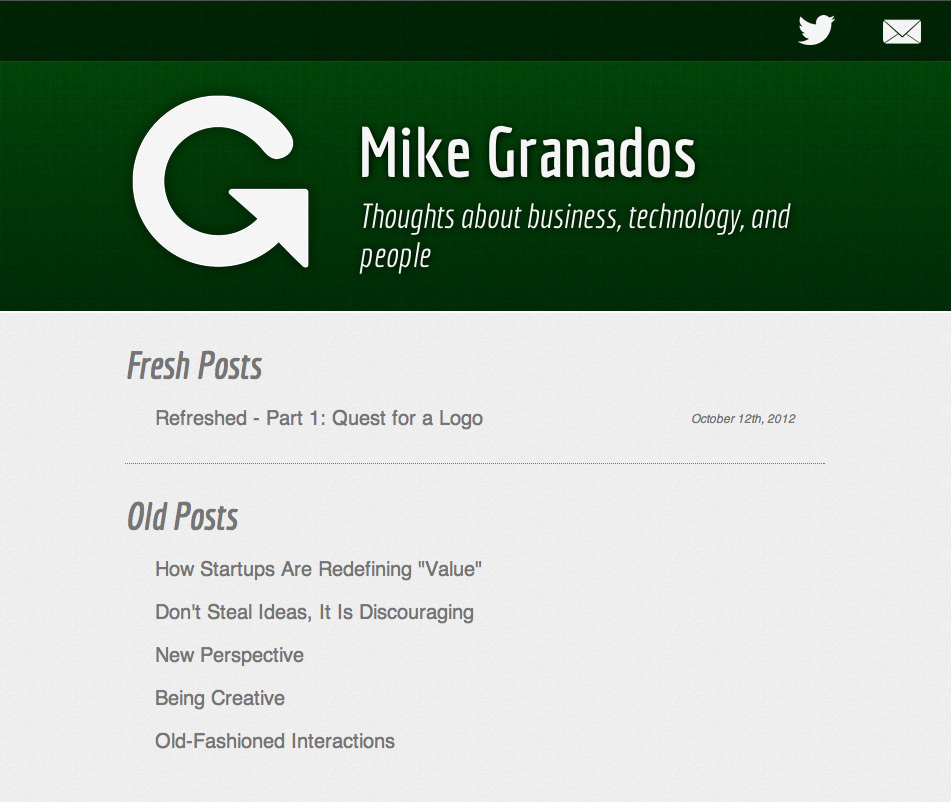
When I created my logo two weeks ago, I didn’t have to give my website redesign much thought, it all just fell into place. I chose a rich green as the main color because green is my favorite color and contrasts beautifully with lighter colors. There are a few subtle textures but nothing fancy. I wanted it to be professional, clean, and minimalistic. The design’s main purpose is supporting the content, my writing. My website has not only shifted its appearance but I have completely revamped my approach to content creation and online publishing.